Walk through creating scatter plots, filters, pie charts and image overlays
Contents
- Introduction
- Display a scatter plot of intensities for differentiation and stemness markers
- Compare nuclei intensities between conditions
- Create nuclei categories based on intensities of the differentiation marker
- Display intensities of the differentiation marker
- Display an image with differentiation marker intensities
Introduction
In Walk through a nuclear markers analysis we displayed data for differentiation and stemness markers using histograms. Here we will continue with that example to compare differentiation and stemness data using scatter (bubble) plots. We will then use filters to create nuclei categories based on the intensities of the differentiation markers and then display these, for both control and treated samples, using pie charts. Finally, we’ll display one of our images with the differentiated and undifferentiated cells highlighted.
Display a scatter plot of intensities for differentiation and stemness markers
We can display a 2D scatter (bubble) plot of intensities for the Differentiation and Stemness markers for all nuclei identified nuclei as follows:
To create a new scatter plot, click the 2D scatter (bubble) plot icon in the horizontal toolbar: ![]()
Now, as we did when displaying a histogram:
- Click the Change Data Set icon .
- Select Nucleus (Node) in the MetaModel Browsing panel.
- Click Change, next to the Target Type field, on the right of the Dataset Builder dialog.
- Click Done at the bottom of the Dataset Builder dialog.
- Click the Change Dimensions icon,

As we are displaying a 2D scatter plot, we need to select data for both the X and Y axes. Here, we wish to plot the mean intensities for the differentiation marker (channel 0) against the stemness marker (channel 1), so:
- In X Axis section, from the Select a Dimension drop-down list, select Mean Intensity 0
- In Y Axis section, from the Select a Dimension drop-down list, select Mean Intensity 1
- Click OK
The mean intensities for differentiation and stemness will be plotted:
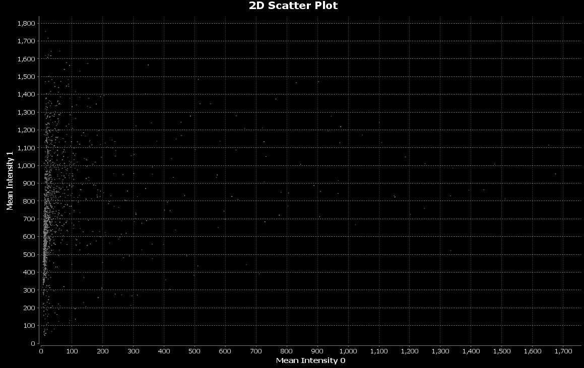
We can make the bubbles bigger:
- Click the Bubble Scale icon

- Enter 10.
- Click OK
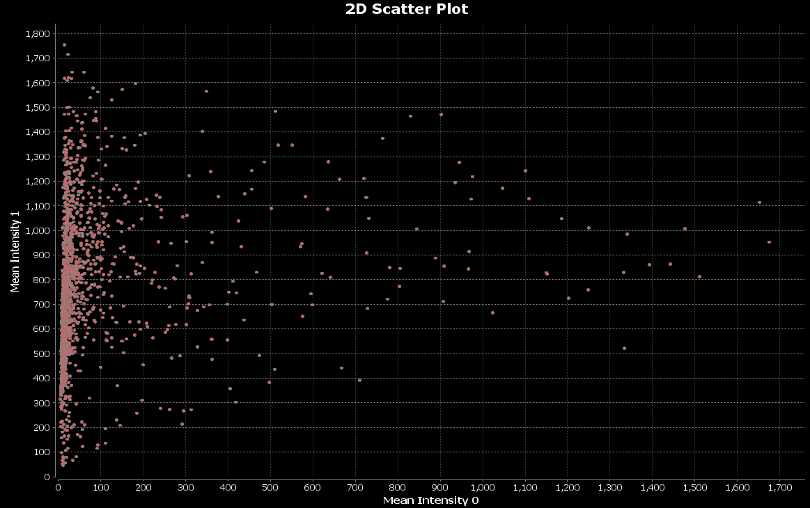
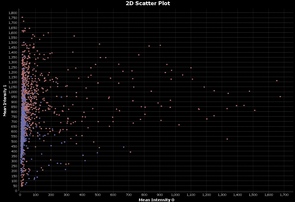
Compare nuclei intensities between conditions
As we did with our histograms, we can use our ‘Control’ and ‘Treated’ filters that we created in Walk through a nuclear markers analysis to group nuclei based on the image group they belong to and display these groups on a scatter plot.
Click the 2D scatter (bubble) plot icon in the horizontal toolbar: ![]()
Now, create a data set that uses the ‘Control’ filter, following the same steps as before:
- Click the Change Data Set icon .
- In the Search Strategy panel, select Create a Path
- In the Metamodel browsing panel, select Image (Node)
- In the Path Definition’s Start block, double-click on the ‘?’
- In the Metamodel browsing panel, select Nucleus (Node)
- In the Path Definition’s Finish block, double-click on the ‘?’
- Right-click on the arrow within the Image element in the Path Definition’s Start block, and select Split here.
- In the Path Splitting panel, select Split in 2.
- In the MetaModel Browsing panel, click Available Filters to expand the Available Filters panel.
- Select the Control filter.
- Click Change
- In the Filter Combination panel, enter the following values:
- Accepted: Control
- Rejected: Treated
- In the My DataSet panel, right-click Rename Me…
- Enter: Control and Treated
- Click Done at the bottom of the Dataset Builder dialog.
Now, configure the scatter plot to use the data, as we did above:
- Click the Change Dimensions icon,
- In X Axis section, from the Select a Dimension drop-down list, select Mean Intensity 0
- In Y Axis section, from the Select a Dimension drop-down list, select Mean Intensity 1
- Click OK
- Click the Bubble Scale icon
- Enter 10.
- Click OK
Create nuclei categories based on intensities of the differentiation marker
We will now create two categories of nuclei - differentiated and undifferentiated - based upon the intensities of the nuclei. We will assume that differentiated nuclei have a median intensity of greater than or equal to 100. All other nuclei are undifferentiated.
Let’s create a filter for differentiated nuclei:
- Select Data => New Filter
- Select Nucleus (Node)
- Select Create a filter based on the nodes attribute
- Click Next
- Select Item attribute
- Select Median Intensity
- Click OK
- Select ≥
- Select Constant
- Enter 100.0
- Click OK
- Click INS
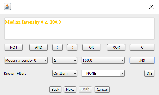
- Click Next
- Enter Name: Differentiated cells
- Click in the Short Description area
- Click Finish
In the MetaModel View, a Differentiated cells node will appear, related to the Nucleus node.
Right-click on the Differentiated cells node and select Show Count. A dialog will appear stating that ‘There are currently 182 differentiated cells’.
Create another filter, named Undifferentiated cells, following the above steps, but with the following changes:
- Select <, not ≥
- Enter Name: Undifferentiated cells
When the Undifferentiated cells node appears in the MetaModel View, right-click on it and select Show Count. A dialog will appear stating that ‘There are currently 1402 differentiated cells’.
The sum of the differentiated cells, 182, and undifferentiated cells, 1402, sums to 1584. We can check our filters are correct, by inspecting the Nucleus node itself.
Right-click on Nucleus (Node) and select Show Count. A dialog will appear stating that ‘There are currently 1584 Nucleus’.
Display intensities of the differentiation marker
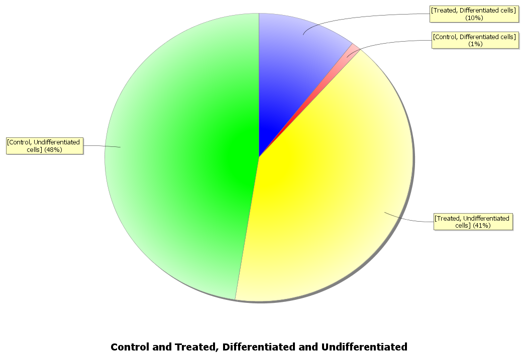
Let’s now create pie charts to display the proportions of undifferentiated to differentiated cells for both our control and treated conditions.
- Click the pie chart icon
- Click Change Data Set icon .
- In the Search Strategy panel, select Create a Path
- In the Metamodel browsing panel, select Image (Node)
- In the Path Definition’s Start block, double-click on the ‘?’
- In the Metamodel browsing panel, select Nucleus (Node)
- In the Path Definition’s Finish block, double-click on the ‘?’
Before, when we split, we selected Split in 2, assuming that anything not accepted by our Control filter was treated. Here we will use another approach, explicitly grouping by each filter:
- In the Path Definition’s Start block, right-click on the arrow and select Split here.
- In the Path Splitting panel, select Group by Filter.
- In the Available Filters panel, select Control
- Click Add
- In the Available Filters panel, select Treated
- Click Add
We’ll now group Nucleus according to whether they are differentiated or undifferentiated cells:
- In the Path Definition’s Finish block, click One Group
- In the Target Grouping panel, select Group by Filter.
- In the Available Filters panel, select Differentiated Cells
- Click Add
- In the Available Filters panel, select Undifferentiated Cells
- Click Add
- In the My DataSet panel, right-click Rename Me…
- Enter: Control and Treated, Differentiated and Undifferentiated
- Click Done at the bottom of the Dataset Builder dialog.
A pie chart will appear showing the proportion of differentiated and undifferentiated cells for both control and treated conditions:
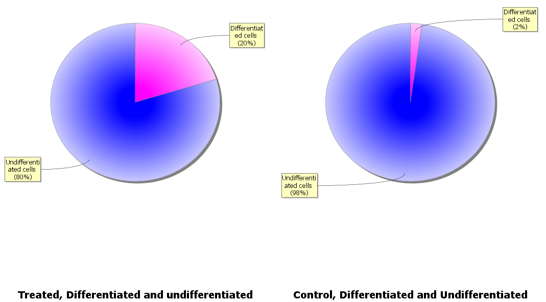
Instead of a single pie chart, we might want one to show the proportion of differentiated to undifferentiated cells for the control condition and one for the treated condition. We can do this by copying our dataset then updating each so we have one for the control condition and one for the treated.
First, update the dataset to handle the control condition only:
- Click Change Data Set icon .
- In the Path Definition’s Start block, right-click the split icon and select Remove
- In the Path Definition’s Start block, click No Filter
- In the Available Filters panel, select Control
- In the Path Definition’s Start block, right-click No Filter and select Choose from the filter list
- In the Path Definition’s Start block, No Filter will update to Control
- In the My DataSet panel, right-click Rename Me…
- Enter: Control, Differentiated and Undifferentiated
- Click OK
Now, copy this dataset and update the copy to handle the treated condition only:
- In the My DataSet panel, right-click Control, Differentiated and Undifferentiated and select Duplicate
- Enter: Treated, Differentiated and Undifferentiated
- Click OK
- In the Path Definition’s Start block, click Control
- In the Available Filters panel, select Treated
- In the Path Definition’s Start block, right-click Control and select Choose from the filter list
- In the Path Definition’s Start block, Control will update to Treated
- Click Done
Two pie charts, one for the control condition and one for the treated will now appear:
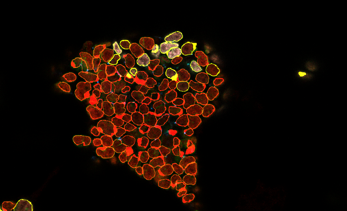
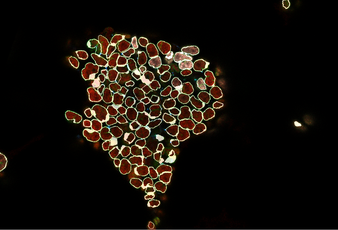
Display an image with differentiation marker intensities
We can display one of our images with an overlay that is coloured according to whether our nuclei are differentiated or undifferentiated, using the Image module and our filters:
- Click the Image icon in the horizontal toolbar:

- Click Change Data Set icon .
- In the Path Definition’s Start block, select Treated_1.ics from the drop-down list.
- In the Metamodel browsing panel, select Nucleus (Node)
- In the Path Definition’s Finish block, double-click on the ‘?’
- Click Done
A progress bar will appear with the message “Loading image, please wait”.
The image will then appear:
Drag the mouse to rotate the image.
Roll the mouse wheel to zoom in and out of the image.
Use the horizontaol scroll-bar to view different images in the Z-axis.
Now, we’ll add an overlay based on whether the cells are differentiated or undifferentiated, using our filters:
- Click the Change Data Set icon .
- In the Path Definition’s Finish block, click One Group
- In the Target Grouping panel, select Group by Filter.
- In the Available Filters panel, select Differentiated Cells
- Click Add
- In the Available Filters panel, select Undifferentiated Cells
- Click Add
- Click Done at the bottom of the Dataset Builder dialog.
A progress bar will appear with the message “Loading image, please wait”.
The image will then appear:
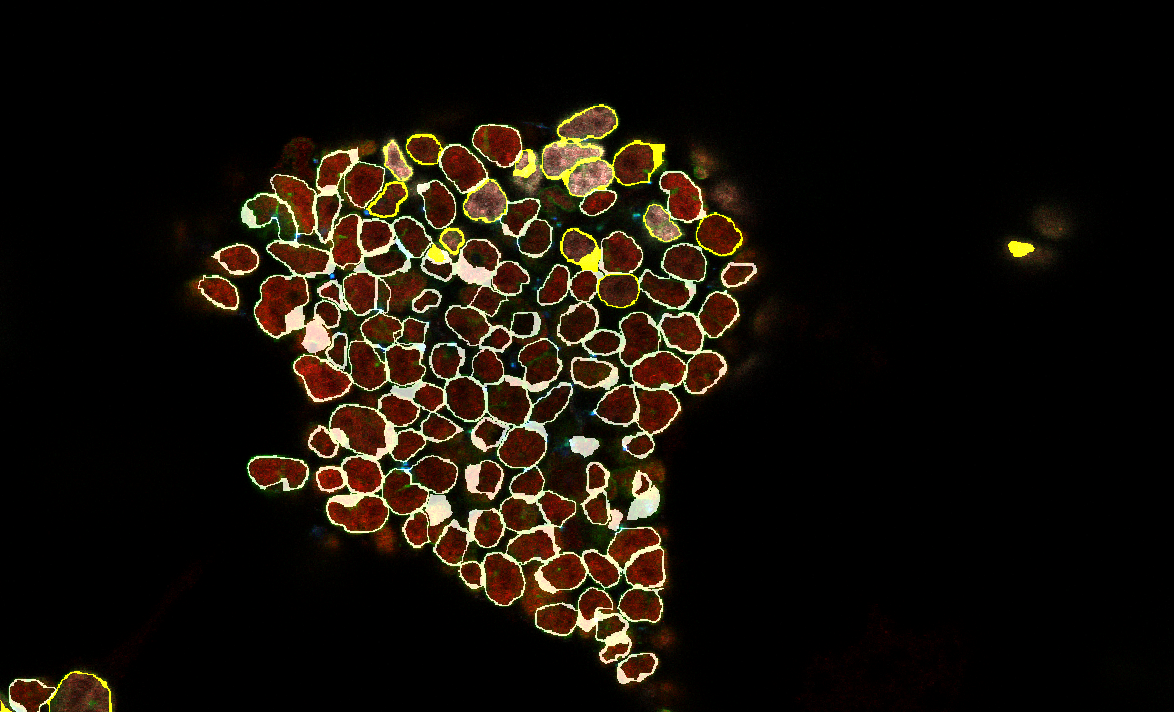
The differentiated cells are shown in yellow.
We can change the colour of undifferentiated cells, default grey, as follows:
- Click the Colours icon .
- Select Undifferentiated cells Nucleus
- Move the vertical slider to red, then click in the large colour area, so that the “New” text is on a red background.
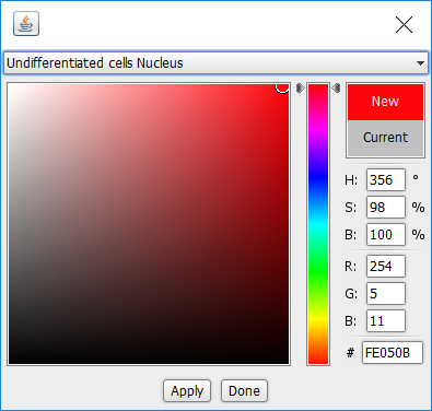
- Click Apply
- Click Done
A progress bar will appear with the message “Loading image, please wait”, then the updated image will appear: